Streamlining test image preparation process
A faster, more reliable way to prepare images for market research studies
Overview
PackSee AI uses a trained AI model to analyze packaging designs, letting clients get results within 48hr and make informed decisions fast. This analysis is run by market research experts (Insights PMs), who take designs from clients, prepare images, run the analysis and get back to the client with results.
PackSee AI DIY needed to change that and to allow clients to run the analysis completely by themselves. To do that, they needed to be able to prepare images in such a way that the AI model can analyze them, a process currently complex and tedious even for Insights PMs.
Research
Earlier user research I conducted on an internal platform had already shown that uploading and preparing images wasn't a straightforward process and took more time than it should. I didn't have hard metrics, but watching users move through the flow I could see them losing track of what to do next, forgetting steps, misclicking and making errors they needed to correct which prolonged the process. Besides behavioural observation, users also reported that the entire process was tedious with some of them saying "they got used to it".
Since I couldn't get access to clients directly, I leaned on those findings and combined them with input from stakeholders, who were also industry leads, on who the clients are and how they actually work. Together with the PO I organized a meeting with these stakeholders to better understand the obstacles and edge cases the solution had to cover. The most important thing to keep in mind about this project was that if clients were going to run this by themselves, the flow had to be simple to follow with minimal guidance and hard to get wrong.
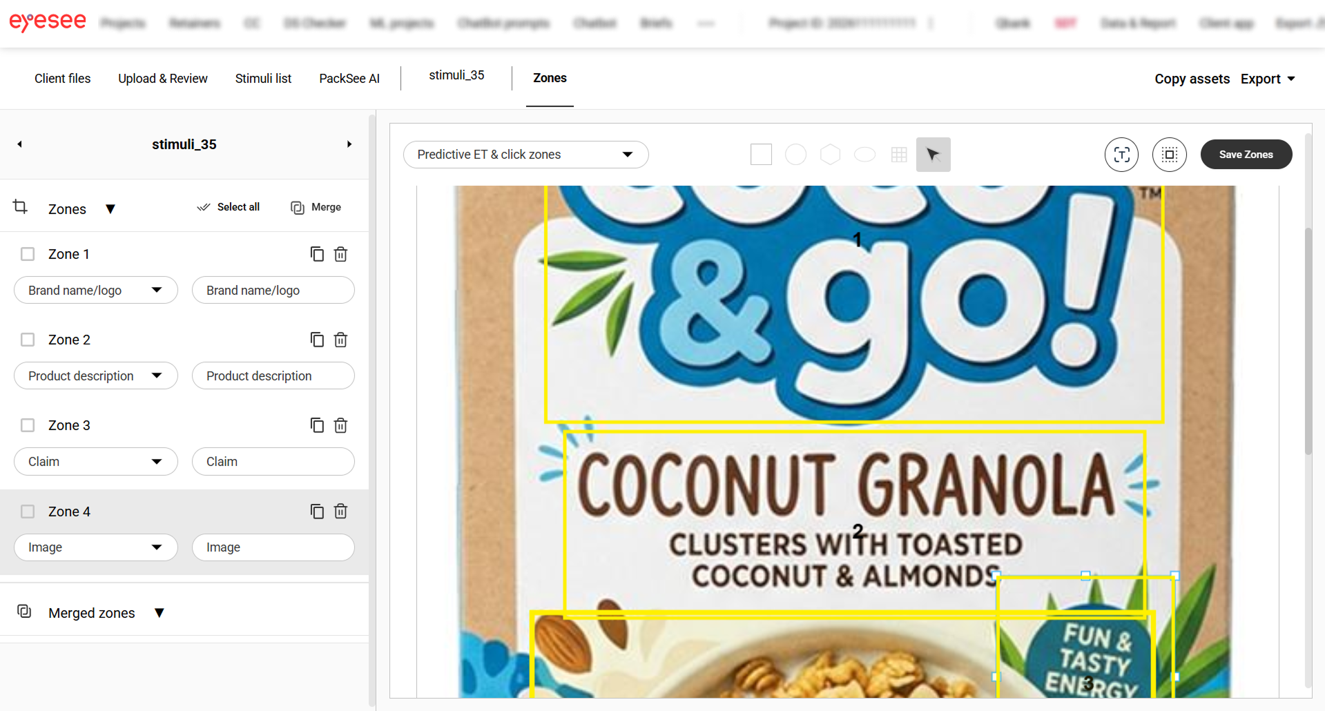
Drawing areas of interest (AoIs) was a tedious task even for experienced users and needed to be simplified. The way IPMs work involves drawing AoI on one image, naming them, and reordering them if needed. Then they move on to the next image, copy the AoIs, resize them and move them into place. Finally, if an AoI doesn't exist on a certain image, they mark it as a Dummy, so the naming, order and number of areas stays the same across all images. This is a crucial part of the process for the AI model to be able to work.
Areas of interest are important because they are what the model actually analyzes. They show what the client considers important on a design, so getting them in place is critical.
On top of that, to check everything was correct before running the analysis, IPMs used an Excel spreadsheet to see whether areas of interest matched across all images. As projects can have 10, 20 or even 40 images, this becomes a very tedious task, and mistakes are bound to happen.
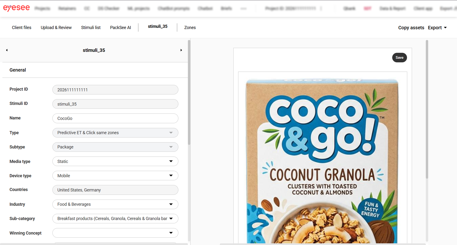
The machine learning team has been working on a model that would allow areas of interest to be drawn automatically with the help of AI, something that needed to be taken into account when creating designs.
Design
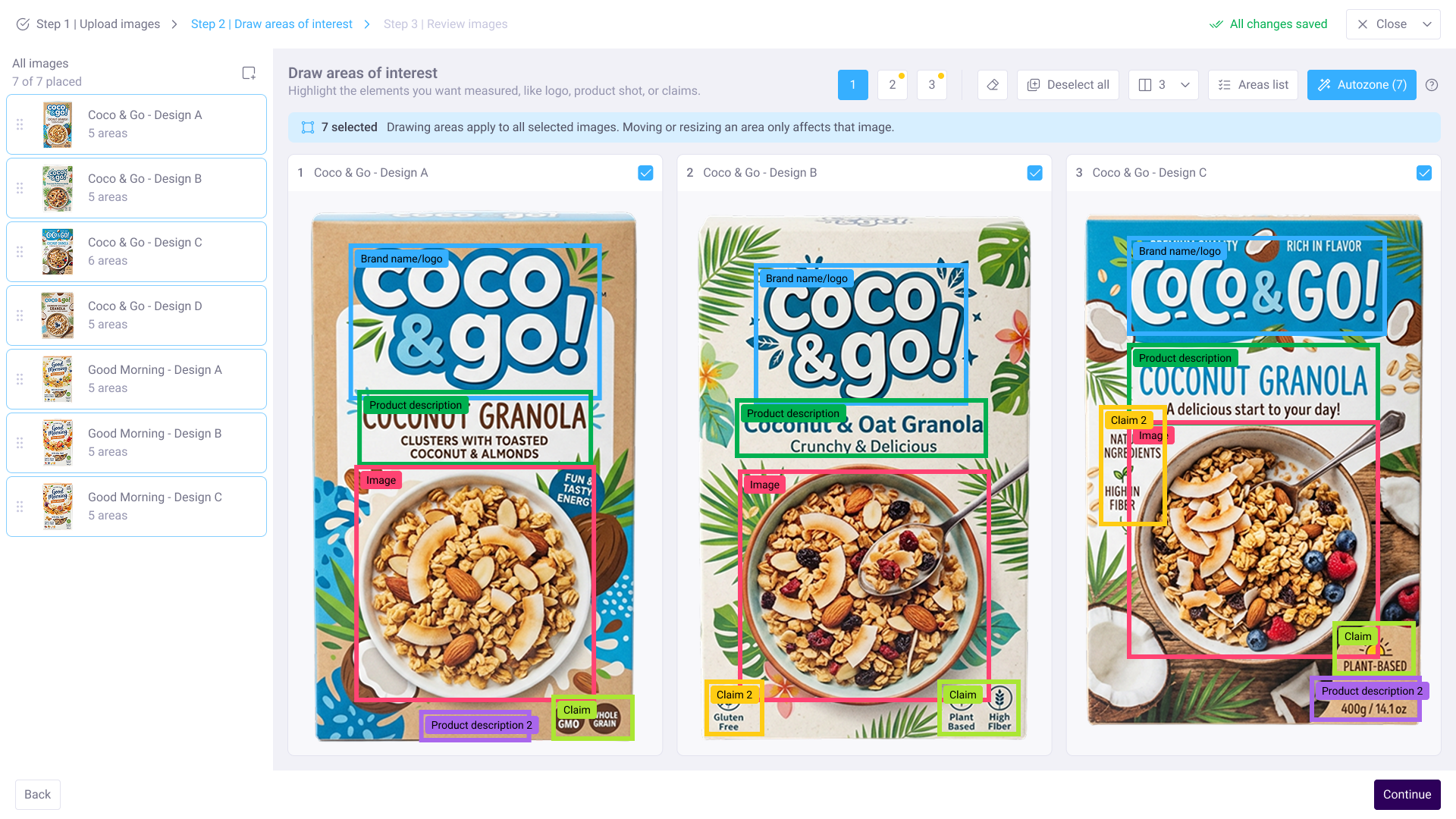
The flow had to work for people who had never prepared images for AI analysis before. I organized it into three mandatory steps: upload images, draw areas of interest and review images. Steps can't be skipped or done out of order, so users always know what comes next.
The flow was the easy part, the hard part was finding solutions for three major problems: making mismatches impossible, helping inexperienced users start fast, and handling large projects.
First problem: AoI mismatches
For the AI model to work, areas of interest need to match in number and order across every image in a project. On the internal platform, IPMs kept this in sync manually and then verified everything in an Excel spreadsheet before running the analysis. With 10, 20 or even 40 images per project, mistakes were bound to happen, and this was the single biggest pain point users reported.
Instead of making the check easier, I removed the need for it. The moment a user draws a new zone on one image, it's automatically created as a placeholder on every other image. If an element doesn't exist on a certain image, the placeholder simply stays, doing the job "Dummy" (placeholder) zones used to do without forcing users to remember to add them. This way, a mismatch is no longer a possible scenario users have to think about.
To allow users to be able to check whether everything is in place while drawing, I have added an Areas list drawer that shows every area across every image at a glance. Missing areas are visible immediately, and clicking "Draw area" focuses the exact panel where it needs to be drawn. Users scan one list instead of clicking through images one by one, so there is no need to lean on external tools to check mismatches.
And even if users make a mistake, one last step will let them review images and areas that were drawn. This step was reintroduced after testing with users and it helped restore the sense of control over the process, so they can run the analysis more confidently.
Second problem: Fast start
The ML team was building a model that draws areas of interest automatically. My job was to design how people actually use it. The core decision was to nudge users into using it, so they can prepare images faster, but not force them to use it. To allow that, the autozoning feature gets suggested the first time a user is on this step, but users can choose to ignore it and draw from scratch. Inexperienced users get zones on all their images in one click, while the more advanced users aren't limited.
The autozoning feature doesn't always get areas right, so it was important to handle this properly. During the upload step, before this model even runs, images are checked to see if they meet the resolution and format requirements the model needs to perform well, so bad input is hard to have. And because autozone suggestions are regular areas and not something new, fixing errors works the same as any other edit: users can resize areas, delete them, remove areas from an image or altogether from all images.
Third problem: Handling large projects
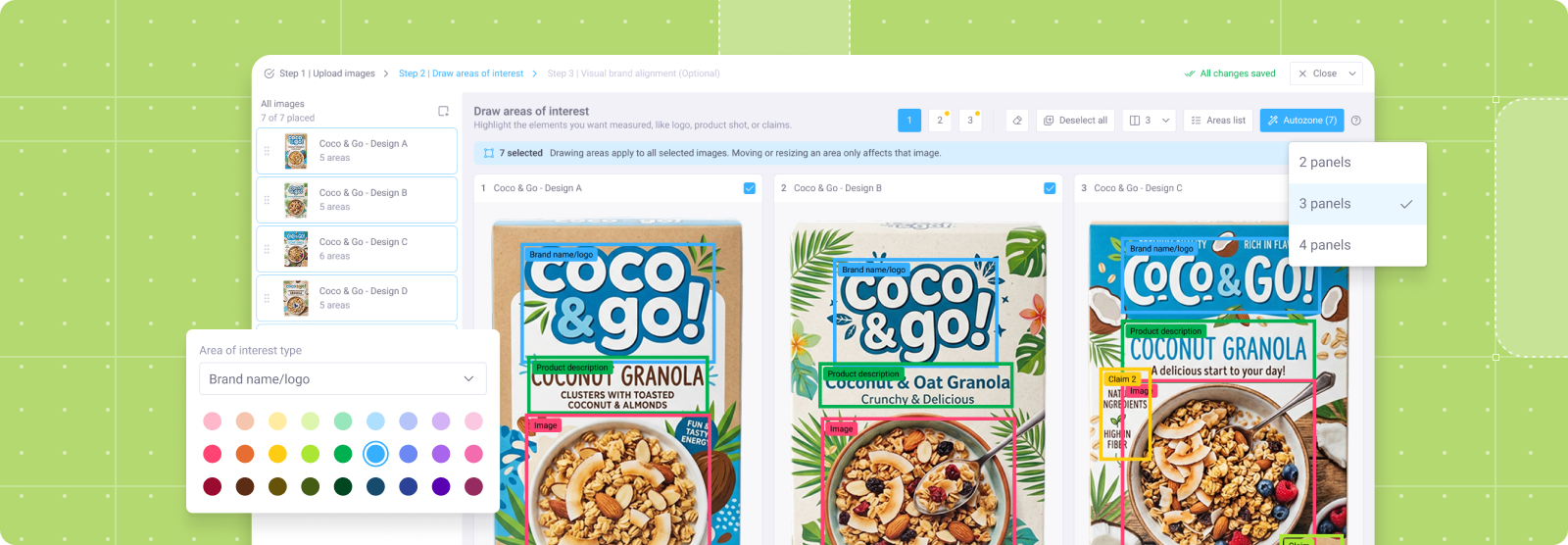
Testing with proxy users showed people needed more designs in the working area at the same time, but cramming more images onto the screen made complex, multi-zone designs unreadable. I resolved this with pagination: users can work on up to 30 designs simultaneously, with 2 to 4 panels visible per page depending on screen size. Selecting all images and drawing an area on one draws it on all of them, so bulk work stays fast even though not everything fits on screen at once.
Area labels needed to be set from a predefined list of labels, so that they could be analyzed. But packaging images often have several areas that can have the same label. For example, a package can have multiple claims or nutritional value information scattered around it. To allow users to quickly find their way around, especially when working on multiple images, I have introduced the color for zones. Each new zone of an existing type gets the next number and a distinct color automatically. The labels carry the meaning, but the color is there to help users visually. To cover edge cases, there are 27 zone colors in three lightness levels, so zones stay visible on both light and dark packaging.
Workflow
To get early feedback on feasibility, I created a user flow and several screens to visualize it, and organized a meeting with the ML and dev team. The team's main concern was saving, specifically how flow disruptions like network disconnections should be handled. I addressed this in the design by allowing users to continue right where they left off next time they open the app, or pick it up later from a banner on the project, so that nobody loses the work due to connection issues.
Bulk area drawing sparked the most discussion, but not as a deal breaker. It was something to have in mind when finalizing designs to cover all of the potential edge cases, as the process was more nuanced than the one on the internal platform.
Next, I worked with stakeholders and iterated until we found the solution that solved all of the potential pain points they think clients might have. For this purpose I have created two prototypes: one that shows the entire flow from the user perspective and another focusing on the crucial part of the process, area drawing.
With their approval, I proceeded to test with three IPMs who differed in their knowledge and acted as proxy users.
Outcome
Test sessions showed that users had no trouble completing the task, and they reported needing significantly less time to draw areas of interest, whether they used Autozoning or drew them manually. The most appreciated part was that the AoIs are counted automatically as placeholders if missing from an image. The solution made it impossible for areas to mismatch, which was the biggest pain point for users on the internal platform.
Another feature that users reported as very useful was the drawer with areas that allowed users to quickly scan what is missing instead of going through each image individually, checking the order and correcting it.
Though praised as useful for drawing, users' actions showed that they are still a bit insecure about continuing with the run analysis. For that purpose the review step was introduced.
Another important insight was that people clicked "Add images" expecting a simple upload and instead got a multi-step process. That gap between expectation and reality was a problem, so I added a three-step explanation upfront that tells users what's ahead and that it will cost them time and later also tokens/money.
The design is now finalized, the handover is complete, and the project is currently in development. Upon release it is necessary to track how many users use Autozoning feature and where they drop off the flow to see if design actually delivers.